Sunday, 9 March 2014
DVD Label drawn design
As explained in the picture, on the background of the entire image on the label, I would like to go for a fiery atmosphere so I am going to use random shapes, that are filled with different shades of red and orange to create this atmosphere, along with some blood splashes etc as well, I saw this used on a disc for 'Red Dead Redemption' and quite liked it, so I thought it would be a good idea to incorporate my own idea for it, an example of the Red Dead Redemption disc shown below.
Font
I decided that the font I wanted to use for my DVD label and DVD case was called Diablo Heavy, downloaded from (http://fontzone.net/download/diablo-heavy) - I quite like this font as it is serif and has many interesting flicks etc within the font itself. In order to get this font I had to download it and then add it in to my system fonts from the control panel to ensure that it will be usable in Photoshop and Illustrator.
Wednesday, 5 March 2014
Self taught photoshop
Lightning Effect
In order to do this I had to firstly add a new blank layer, and then on this layer, I selected the Lasso tool and then drawn and selected an area that I thought would be the best place for lightning to be added.
Then I had to fill this area with white, and then draw, in black, a lightning bolt going downwards and also had to fill it in with the black brush the contents to the left of the lightning bolt, after this I had to apply the Guassian Blur effect, which blurs the edge of the black, as shown in the screenshot below.
After this I had to go to Filter, Render, and then Difference Clouds which looks like it did in the picture shown below.
After this I then had to invert the colours and change the levels of the darker colours, which after inverted, made the bright white lightning bolt stand out. Then after I had done this, if there was any parts that were left outside the lightning bolt that were not black, then I had to colour them in with the brush tool. Once I had filled in with black in all the lighter areas I then had to change the blend mode to 'Screen'. Which looked like this, shown in the screenshot below.
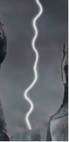
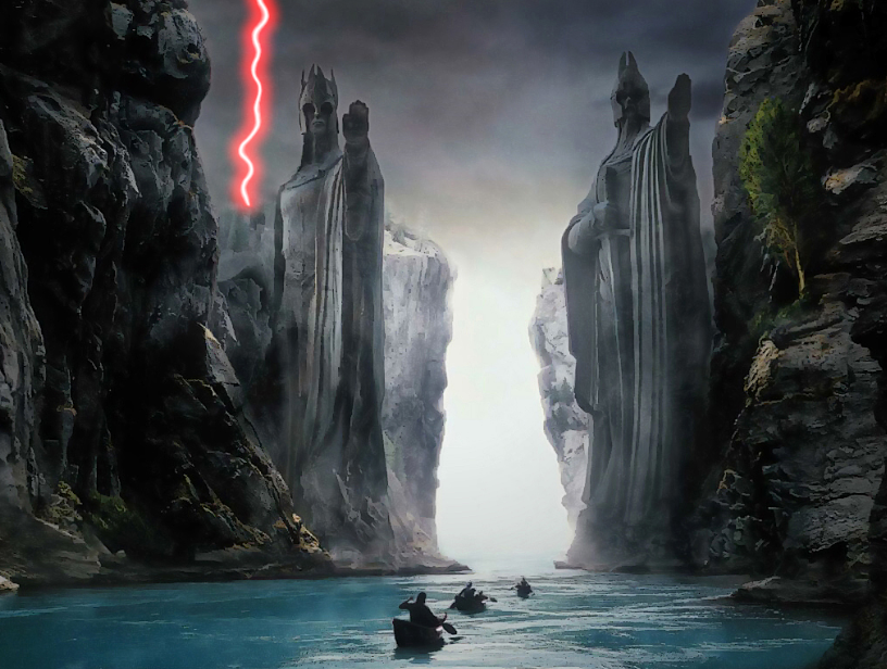
I then created a copy of the layer by pressing CTRL+J, and added the Gaussian Blur to this layer too, and then with this layer I can duplicate this layer as many times as I like to intensify the glow of the lightning. Then I can now change the colour of the lightning by changing the hue and saturation, and then setting it to colorize, in this instance I changed the lightning to a neon red, just to see what it would look like, and the finished lightning bolt is shown in the screenshot below.
In order to do this I had to firstly add a new blank layer, and then on this layer, I selected the Lasso tool and then drawn and selected an area that I thought would be the best place for lightning to be added.
Then I had to fill this area with white, and then draw, in black, a lightning bolt going downwards and also had to fill it in with the black brush the contents to the left of the lightning bolt, after this I had to apply the Guassian Blur effect, which blurs the edge of the black, as shown in the screenshot below.
After this I had to go to Filter, Render, and then Difference Clouds which looks like it did in the picture shown below.
After this I then had to invert the colours and change the levels of the darker colours, which after inverted, made the bright white lightning bolt stand out. Then after I had done this, if there was any parts that were left outside the lightning bolt that were not black, then I had to colour them in with the brush tool. Once I had filled in with black in all the lighter areas I then had to change the blend mode to 'Screen'. Which looked like this, shown in the screenshot below.

I then created a copy of the layer by pressing CTRL+J, and added the Gaussian Blur to this layer too, and then with this layer I can duplicate this layer as many times as I like to intensify the glow of the lightning. Then I can now change the colour of the lightning by changing the hue and saturation, and then setting it to colorize, in this instance I changed the lightning to a neon red, just to see what it would look like, and the finished lightning bolt is shown in the screenshot below.

Reference to photoshop lightning tutorial: http://www.photoshopessentials.com/photo-effects/lightning/
Setting up DVD label template
As you can see in the image above, it shows the correct dimensions in order to create my own template for my DVD disc label. The middle circle, which will eventually would get punched out has to be 8.7mm, and the plastic, transparent ring that goes around it would be 16.7mm. The disc itself would have to have an altogether height of 125.5mm, and a width of 117.5mm.
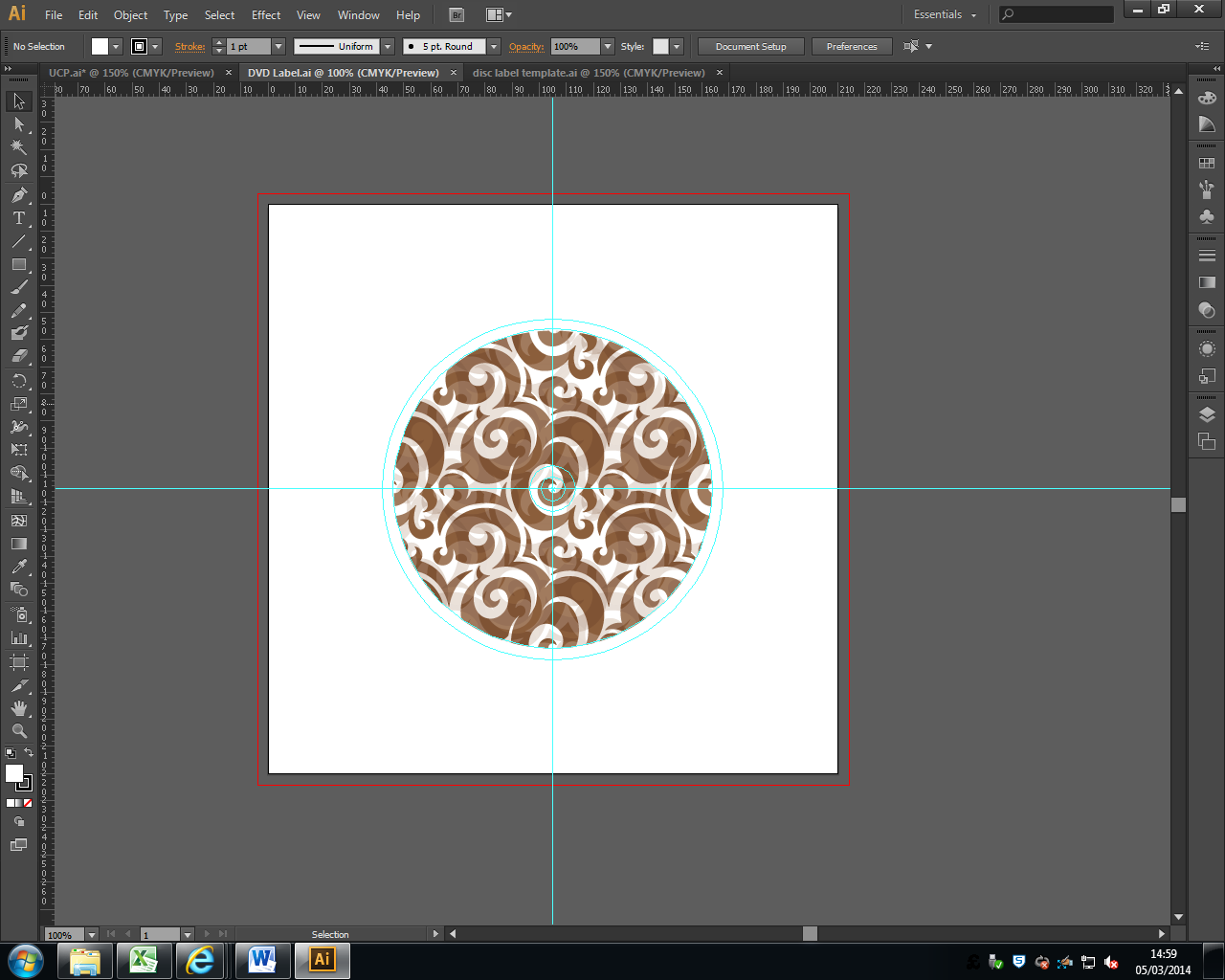
Shown above is the template that I created for my DVD label, it has all the correct required dimensions and a bleed area going around the disc (the circular cyan line).
As you can see in the image above, it shows the correct dimensions in order to create my own template for my DVD disc label. The middle circle, which will eventually would get punched out has to be 8.7mm, and the plastic, transparent ring that goes around it would be 16.7mm. The disc itself would have to have an altogether height of 125.5mm, and a width of 117.5mm.

Shown above is the template that I created for my DVD label, it has all the correct required dimensions and a bleed area going around the disc (the circular cyan line).
Saturday, 22 February 2014
Tools
Colour Replacement Tool
I have been playing around with this tool for a few hours on numerous different images, including taking my own and replacing the colours, what I think is beneficial about this is that companies can use this to see what their products would look like in different colours, to see if its worth it, or even customers, for example a customer might want to spray their car a different colour but would like to see what it would look like first. This is what I used this tool for, with the before and after pictures shown below.
I enjoyed using this tool to see what my car would look like in multiple different colours. One of the problems I found with this tools was that you cannot use it to turn a a light colour, like silver, to black.
Monday, 17 February 2014
Setting up DVD case inlay template
To get to this point I had to go to File, and click New, in order to create a new Photoshop document so that I could start creating my template. Above is a screenshot of the details of my DVD inlay template, as you can see I changed the measurements to millimeters. The width is set as 276mm, although it should be 272mm, but I added 4mm so I could have a 2mm bleed area on the left and right side of the template. The height is set at 188mm, although again it should be 184mm, but I added an extra 4mm of space in order to have a 2mm bleed area at the top and bottom of the template. For the resolution I changed it to pixels per inch (dots per inch/DPI) and put 300 for the resolution, this will be for when it gets printed, and i left the color mode as CMYK (cyan, magenta, yellow, back) because that is what is used by printing companies. Also, I left the background contents as transparent so that I can create the template without having a fixed colour, and it not being locked. For the DPI, I have set it to 300 pixels per inch (PPI), so that when it is printed it will be in good quality.
Wednesday, 12 February 2014
Selection Tools
There are many different selection tools within Photoshop, and they can be used for different things, in this post I will be explaining and showcasing what the different tools do and how they differ from one another.
Rectangular Marquee Tool
Rectangular Marquee Tool
As you can see above that is the rectangular marquee tool, it creates a rectangular shape where you click and drag, the rectangular shape is nick named 'marching ants'. To get the shape closer to the image you wish to move around or manipulate, in this case the tower, then you can use the 'subtract from' tool which is located at the top of the page in Photoshop shown in the screen shot below.
When this tool has been selected you can just click and drag to remove segments from the already selected area around the tower, although this is the not the best selection tool to use for this. You can see what it will look like in the screen shot below.
As you can see it is not the most effective tool to select finely around edges, although this tool would be good for selecting around very straight edges.
Polygonal Lasso Tool
The next tool is the polygonal lasso tool which allows you to click and it creates a dot and then in instant straight line will appear and every time you click it will create an extra line around the object you are trying to select which is effective although it does prove difficult to get it exactly perfect, you can also zoom in to try and get added detail, you can see my attempt in the screen shot below.
So as you can see from the screen shot above it is a lot more effective at selecting the tower than the previous tool, although still it is not perfect.
Quick Selection Tool
This is my favourite of the selection tools, this is because it is quick and easy and tries to guess at what object you're trying to select based on the colours around the image, an example of this and where to find it is shown in screenshots below.
Shown in the screenshot above i tried to select the statue on the right of the picture shown by the marching ants line around it, this was quick and easy to do and is relatively good detail because the colours aren't exactly the same, they contrast.
Lasso Tool
This tool is difficult to use to select things in a picture although when zoomed in to a picture by holding alt and scrolling in with the mouse, it can be more effective. As shown in the screenshot below, you can see I have freehand selected around a blue building in the image.
Monday, 10 February 2014
DVD Case Template
DVD Case Template
Below is a
screenshot of a template of my DVD case, the guidelines show the dimensions of
the print out, with the spaces outside on the edge being the bleed area so that
no important parts of the graphics are cut off of the paper as the bleed area
is the bit that will get cut off, this is because the image is usually printed
larger. The dimensions of the DVD case template are as follows, the vertical
guide lines on the left and right, as well as the horizontal ones at the top
and bottom are 3mm from the edge too allow for a 3mm bleed area. The vertical
and horizontal guide lines in the very middle are just to show where the middle
of the template is, whereas the two lines on either side of the middle vertical
guide line shows the width of the spine, which is 14mm.
Sunday, 9 February 2014
Initial ideas for game/movie
Initial ideas for game/movie case
label
I know the
main genre for my movie/game would be medieval as I have always liked them sort
of games and movies, for example Lord of the Rings etc. I believe it also would
be fun taking images and placing them in to many different scenes, as those
kind of films are not limited to one, there are usually scenes filled with
greenery and vivid lighting, destroyed worlds covered in ash and ruined
buildings, and then in between the two, bleak city centres too. It is also worth
mentioning that in these films all the elements are used intensely which I could
make look effective, for example, fiery explosions, water crashing against solid structures, also trees and other things moving around.
Another idea I
had for my project would be to go in a more sci-fi direction, like the Star
Wars films/games. This is because you can do a lot with effects in a space
universe, ranging from explosions, lasers, and different lighting, although I decided
to stray more towards the medieval aspect as that is what I enjoy more.
Medieval Mood board
Unfortunately I was having trouble on getting the images to arrange properly to form a mood board structure on Blogger.
Subscribe to:
Comments (Atom)


